


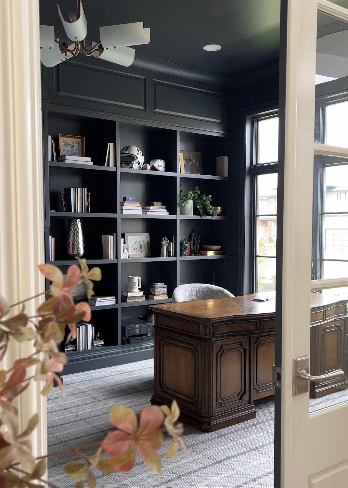


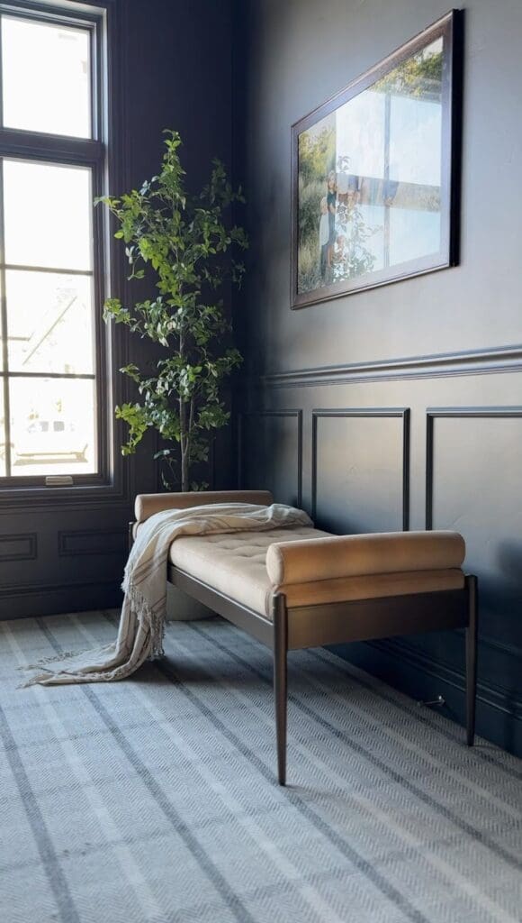
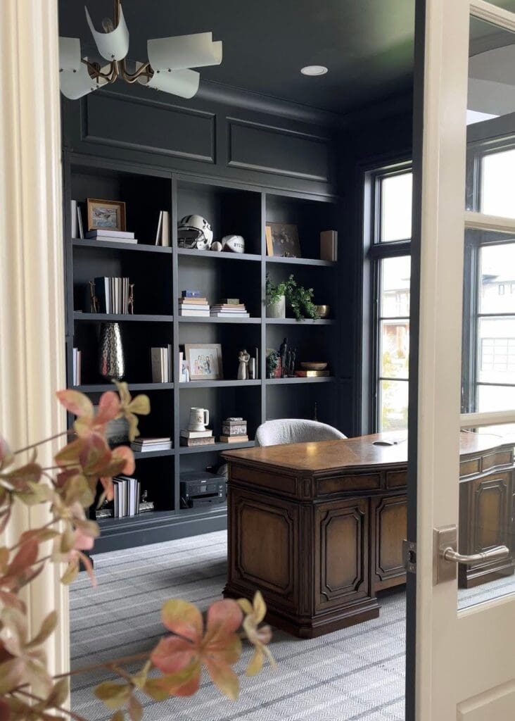
From the very beginning of building our home, I had one thing in mind for our office space: deep, dark, moody color-drenched walls. You know that feeling when a room just hugs you in the best possible way? That’s what I wanted this office to feel like. Cozy, collected, and maybe just a little dramatic, the major inspiration for choosing the Sherwin-Williams Cyberspace!
Blue was at the top of my list from the start. But let’s be honest—I wavered. Green was having a major moment on Pinterest. Earthy, rich, foresty greens were everywhere, and I loved them too. But in my gut? I knew that blue paint, especially the right shade, would stand the test of time.
Spoiler alert: I stuck with my gut. And I’m so glad I did.
The Paint Color: Sherwin-Williams Cyberspace
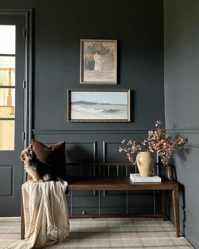
We chose Sherwin-Williams Cyberspace for the entire office—walls, ceiling, trim, baseboards, and even the doors. Yup, we went all-in with the color drenching method, and it completely transformed the space.
Color: Cyberspace by Sherwin-Williams
Sheen: Matte
Paint Line: Sherwin-Williams Emerald Latex Paint
Pros: Durable, long-lasting, and easy to clean)
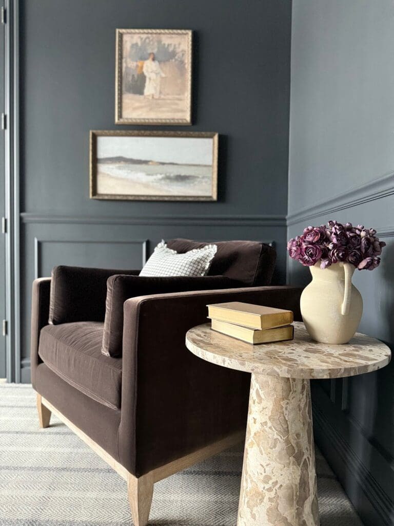
This shade of blue has so much depth. It’s technically classified as a charcoal, but as you can clearly see—it leans blue in the best possible way. The light reflectance value (LRV) is super low, meaning it’s a true moody hue.
Even better? Sherwin-Williams lists Cyberspace as a neutral, so it works well with almost any decor or art style. Whether you’re designing a reading nook, home office, or dramatic powder room, this is one of those moody paint colors that won’t let you down.
Why Blue Was the Right Choice (Even When It Wasn’t “Trending”)
Let’s have a little heart-to-heart: Blue isn’t exactly trending in the world of wall paint right now. But that’s okay. Because here’s the truth—a good blue paint color is always classic.
Our home leans traditional with touches of modern, and a saturated blue like Cyberspace brings a perfect contrast. It softened the traditional edges while adding a bold, cozy sophistication. The result is a space that feels thoughtful, layered, and just the right amount of bold.
And every time I walk into this room? I love it even more.
All the Paint Details—Because I Don’t Believe in Gatekeeping
I’m always happy to share what we used, down to the nitty-gritty. So here’s everything:
- Color: Cyberspace by Sherwin-Williams
- Sheen: Matte
- Paint Line: Emerald Latex Paint (a different line would reduce cost, but this one has incredible coverage and durability)
- Application Method: Color Drenching—same color and sheen on walls, trim, ceiling, baseboards, and doors
- Cost: ~$94/gallon (and totally worth it)
This paint formula has been phenomenal—fingerprints and dust are easier to wipe off (which makes my inner clean freak happy), and it just looks so polished.
What We Paired It With
Can we talk carpet for a second? Because this was a true love-at-first-sight situation.
We paired Cyberspace with Stanton Tattersall in the color Shadow, and it’s basically the soul mate of this paint color. The warmth and pattern in the carpet ground the space beautifully, keeping it from feeling too cold or cave-like.
It’s one of those combinations that just clicks.
Final Thoughts: Go Bold or Go… Beige?
If you’ve been on the fence about trying a darker color, especially for a smaller space like an office or reading nook, let this be your permission slip.
You don’t have to follow what’s trending. You just have to love it.
And for us? Sherwin-Williams Cyberspace was the bold, timeless choice that paid off big time.
No regrets. Only blue.
Shop the Office Look
If you’re curious or just nosy like me (no judgment), you can shop our entire office setup here. I’ve linked everything in one easy place with rotating shoppable images so you can get all the details without the detective work.


LEAVE A COMMENT
Comments