


If you’re considering painting your home and want more than just basic walls — you want them to look designer-done — save this post now. This simple yet genius method is the real MVP of designer wall paint ideas — especially if you love cozy neutrals and timeless whites.
Let’s be real: not everyone is into bold color-drenched rooms (though they’re totally fun — we did it in our office and reading nook and loved the drama). But if you lean more classic in your common spaces? This elevated paint technique is your new best friend.
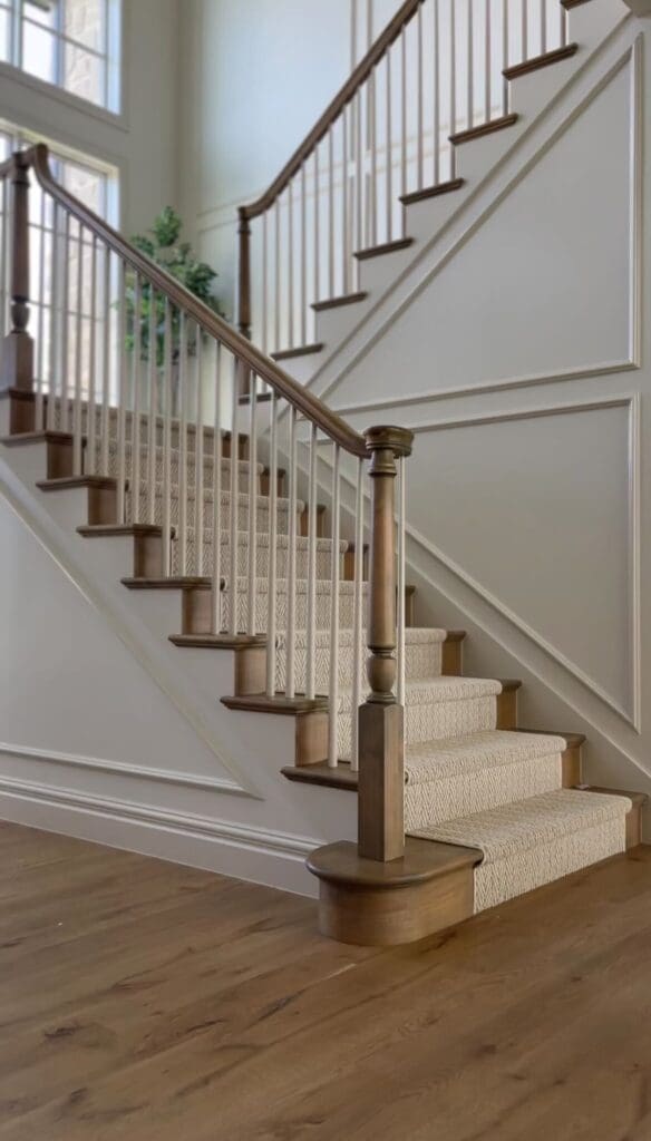
Note: This tip is especially perfect for neutral or light-colored walls only. If you’re working with bold or dark colors, this technique won’t give you the same effect — but I’ve got more ideas coming for those in future posts. Stay tuned!
How to Paint Walls Like a Designer Without Going Full Monochrome
If you’re looking for how to paint walls like a designer in a way that feels subtle and sophisticated, here’s the secret formula we used:
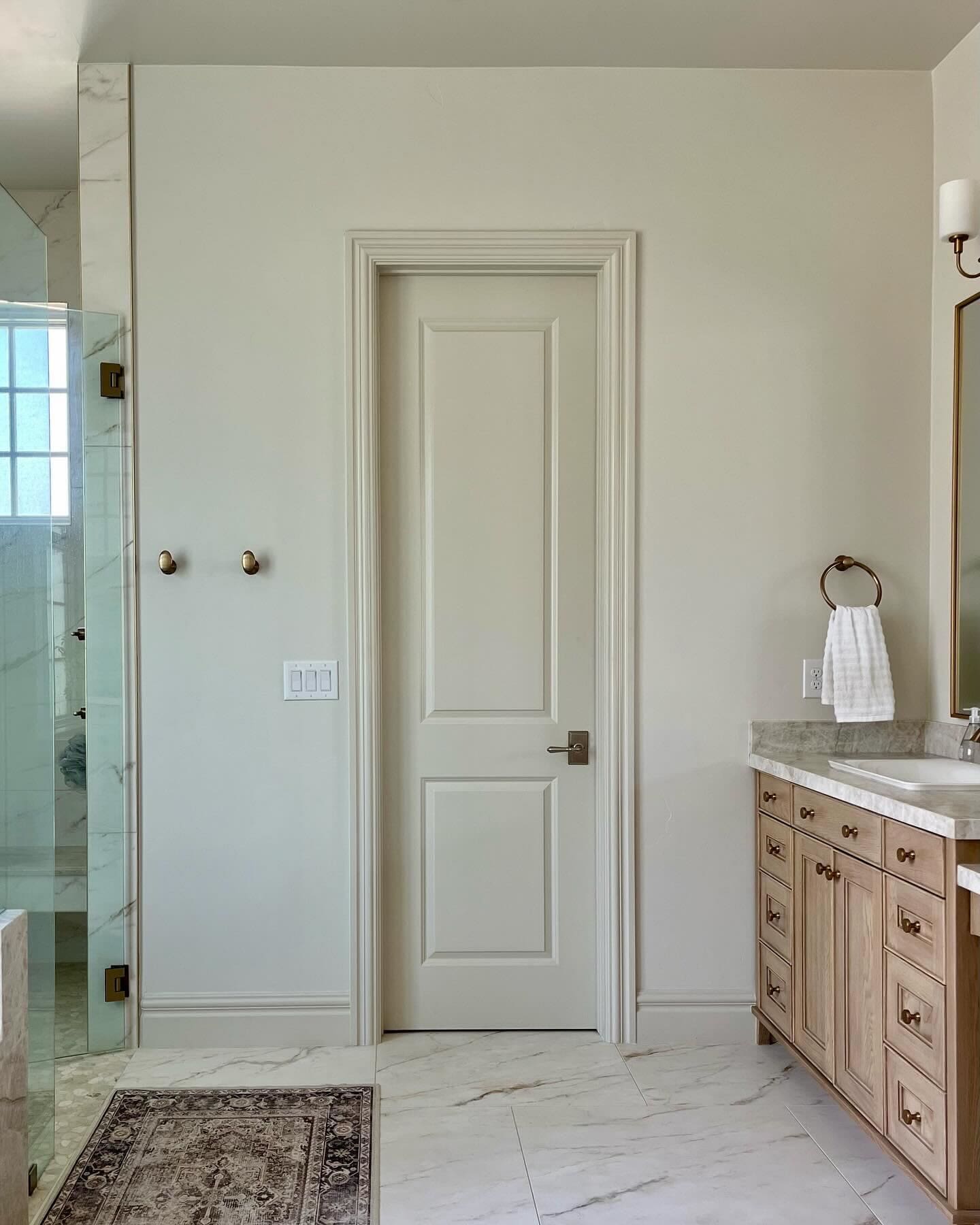
- Paint your walls and ceiling the exact same color and sheen.
- Paint your trim and doors the same color, but at 25–50% more saturated.
That’s it. But wow — the results speak for themselves.
Think: richness, depth, polish… and compliments from anyone who walks in.
It adds a layered paint look that feels high-end without being flashy. And the best part? Your paint store can mix custom tints for you! Just let them know the percentage deeper you want. (Ask your local expert or check out this paint shop.)
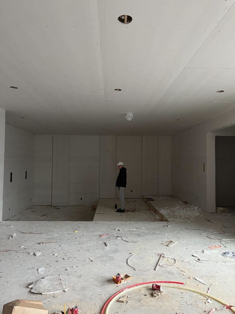
Our Wall and Trim Paint Tips in Real Life
This isn’t just theory — we used these wall and trim paint tips throughout our home. Here’s what we did:
Let’s talk specifics. Here’s exactly what we did in our home, using wall and trim paint tips that anyone can apply.
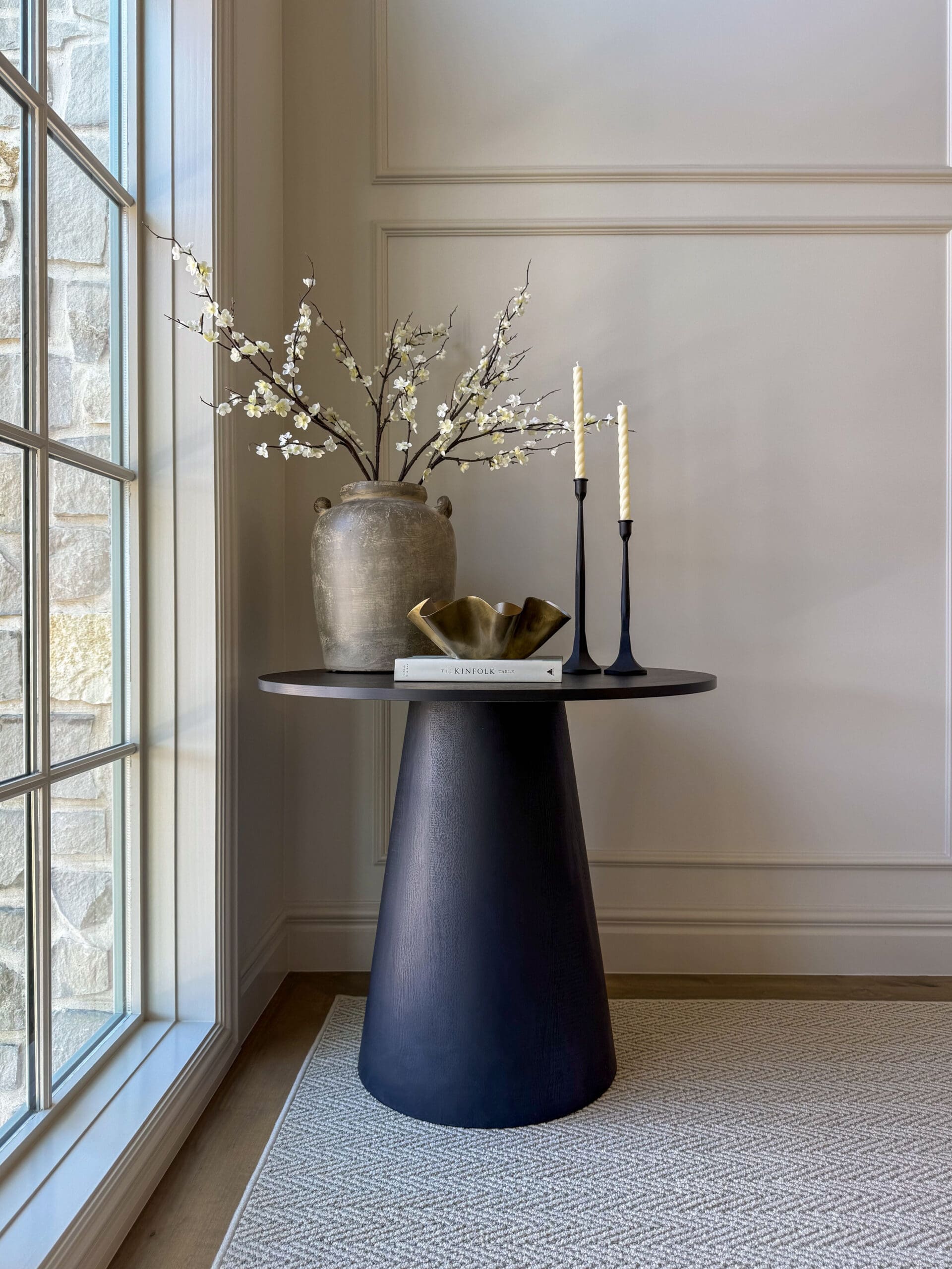
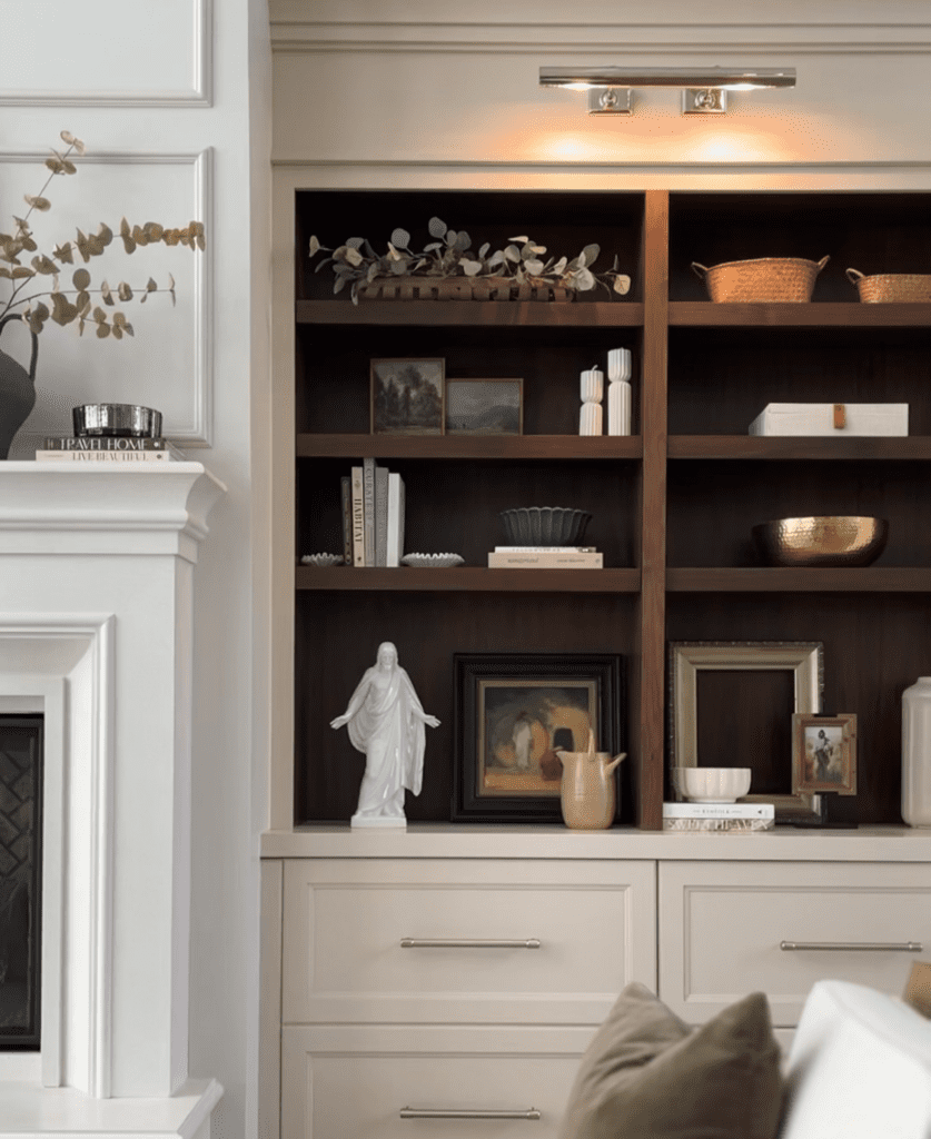
Our cabinets? They’re Sherwin-Williams Accessible Beige in a satin finish.
And our walls? Also Accessible Beige — but we asked the paint shop to reduce it to just 25% strength. So it’s super soft, airy, and barely there — just the cozy warmth we wanted.
Our baseboards, window trim, and pencil trim? Same color — Accessible Beige at 50% strength. Just enough contrast to add a subtle punch without making it obvious.
Want to try this? Ask your local paint store to mix up custom tints or explore Accessible Beige.
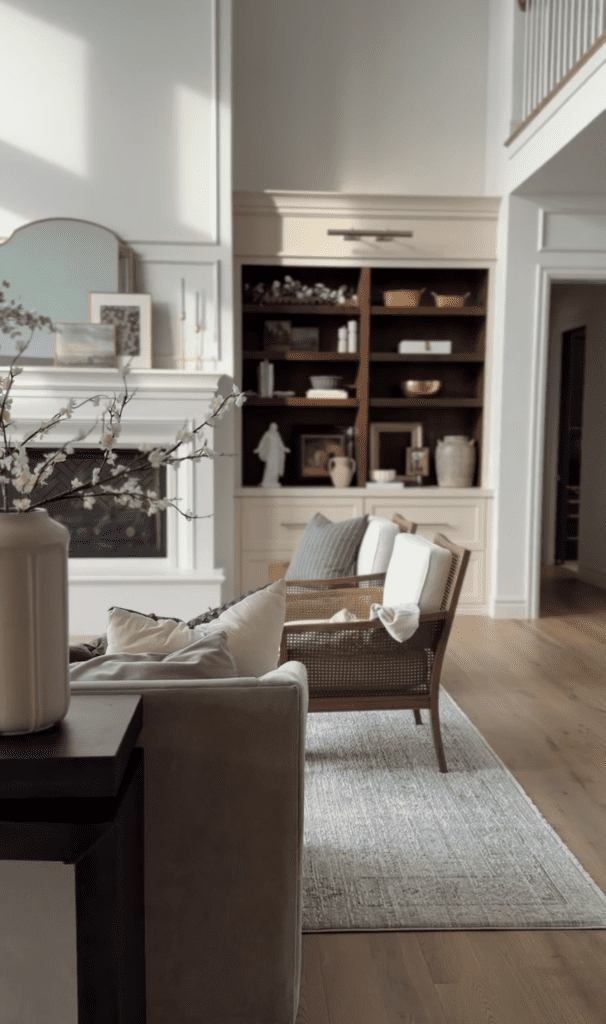
Why This Elevated Paint Technique Works
The magic here is in the depth. Most people paint everything one flat color. And while that’s fine… it’s not the look of a designer-touched space.
This trick mimics the intentional layering designers use — different tones, same family — for a custom wall paint finish that instantly looks elevated.
The room suddenly feels like someone with a very fancy Pinterest board made it happen.
Can I Use This on Any Paint Color?
Not quite.
This technique shines on neutral paint colors — think soft whites, beiges, warm grays. It’s especially effective if your home leans traditional, transitional, or even modern farmhouse.
But if you’re planning a deep navy, moody green, or terracotta moment? Stay tuned — I’ll share color drenching tips in a future post that are made for bolder choices.
Final Thoughts: Small Change, Big Payoff
If you’re craving designer wall paint ideas that feel polished but approachable, try this subtle trick. It works beautifully in living rooms, bedrooms, hallways — any space where you want light, neutral warmth with a little edge.
And don’t forget to:
- Visit your local paint shop and ask for custom mixing. (Here’s our go-to shade: Accessible Beige)
- Stick to this approach for neutral, light-toned walls.
- Layer your tones — walls and ceiling at 25%, trim at 50%.
You’ll end up with a space that whispers elegance… but still feels like home.
P.S. If you want more elevated paint techniques, follow along! I’m sharing all the design secrets we used in our custom home — the wins.
Hi there, I love your painting tips. I’m attempting to give our new modern condo a more traditional design style and may copy you to a T. What sheen of Accessible Beige did you use for your walls & ceilings? Also, I’d love it if you did a little write-up about all the picture frame trim work you’ve done on your walls. It looks amazing! Thanks 🙏🏼
Thank you! I love your color choice and way you have used in different saturations.
You’re an inspiration!
M